2014 | catálogo quase figura, quase forma
DESCRIPTION
Galeria Estação | Exposição QUASE FIGURA, QUASE FORMA | Curadoria Lorenzo Mammì | De 21 de agosto a 10 de outubro de 2014TRANSCRIPT
ww
Quase figura, Q
uase forma
GA
LERIA ESTA
ÇÃ
O 2014
Quase figura,Quase forma
curadoria Lorenzo Mammì
Alcides Pereira dos Santos
Amadeo Lorenzato
Ana Prata
Aurelino dos Santos
Cícero Alves dos Santos [Véio]
Fabio Miguez
Felipe Cohen
João Cosmo Felix [Nino]
João Francisco da Silva
José Bezerra
Marina Rheingantz
Neves Torres
Paulo Monteiro
Paulo Pasta
Sebastião Theodoro Paulino [Ranchinho]
Sergio Sister
Tatiana Blass
QuaseCapa2014.indd 1 15/07/14 19:36

abertura 21 de agosto 19hexposição 22 de agosto a 10 de outubroLocal Galeria Estação
Quase figura, quase forma
curadoria Lorenzo Mammì
2014 ano10
Quasefiguraquaseformaok.indd 1 22/07/14 19:15

Alcides Pereira dos Santos
Amadeo Lorenzato
Ana Prata
Aurelino dos Santos
Cícero Alves dos Santos [Véio]
Fabio Miguez
Felipe Cohen
João Cosmo Felix [Nino]
João Francisco da Silva
José Bezerra
Marina Rheingantz
Neves Torres
Paulo Monteiro
Paulo Pasta
Sebastião Theodoro Paulino [Ranchinho]
Sergio Sister
Tatiana Blass
Quasefiguraquaseformaok.indd 2 22/07/14 19:15

A arte de que a gente gosta
Uma relação pautada na coerência e na seriedade, vinda de uma convivência pessoal
que vem dia a dia se amiudando e que culmina na realização desta exposição. Foi assim
que, conversando no final do ano passado, nós tivemos a ideia de aproximar dois mun-
dos tão distintos e tão próximos por uma razão única: a arte – por toda a experiência
que amplia o nosso mundo e a nossa vida.
Ao sugerir este encontro, afirmamos a convicção de que arte é arte e de que deve-
mos, sim, nos abrir para olhar, ver, enxergar tudo o que é bom e está à nossa volta. Se
não o fizermos, perderemos
Sabíamos ser esse um grande desafio, e por isso de imediato nos veio a ideia de
convidar Lorenzo Mammì, um pensador que muito respeitamos e que, não tínhamos
nenhuma dúvida, daria conta de fazer uma análise dos encontros e desencontros que
os mundos “popular” e “erudito” nos proporcionam.
Se nossa ideia era ampliar e trazer um dado novo, tínhamos certeza de que todos os
artistas e galerias envolvidos se sentiriam honrados em participar desta nossa emprei-
tada. E assim acontece Quase figura, quase forma.
Socorro de Andrade Lima
Vilma Eid
Quasefiguraquaseformaok.indd 3 22/07/14 19:15

4
Cícero Alves dos Santos [Véio]Sem título, 2012Escultura em madeira, tinta acrílica46 x 18 x 10 cm
Quasefiguraquaseformaok.indd 4 22/07/14 19:15

5
Quase figura, quase forma Lorenzo Mammì
Colocar lado a lado obras que, por falta de melhor termo, costumam ser classificadas
como “eruditas” com outras que derivam do circuito paralelo, mas no Brasil especial-
mente viçoso, da arte popular é uma tarefa delicada. As referências dos artistas não são
as mesmas, embora possa haver semelhanças pontuais. A escala de valores depende do
contexto. Mesmo assim, parece-me possível identificar, entre a produção “erudita” e a
popular dos últimos trinta anos, uma convergência que vale a pena explorar. Ela diz
respeito não apenas a mudanças de poética, mas também a transformações da própria
circulação da arte e da consciência que os artistas têm de seu próprio trabalho.
Quanto ao primeiro grupo: as três últimas décadas colocaram de novo a figuração
em pauta. Não apenas a fotografia e o vídeo, para os quais a relação com um referente é
característica estrutural, mas também e talvez em primeiro lugar a pintura retomaram,
já no final da década de 1970, a questão da imagem. As duas primeiras, aliás, renova-
ram seu repertório justamente se medindo com os procedimentos e as modalidades de
apresentação da pintura. Talvez se possa dizer que, se o século XX foi tendencialmente
um século de abstração, o XXI começa como século figurativo. Dito de outra maneira:
Quasefiguraquaseformaok.indd 5 22/07/14 19:15

6
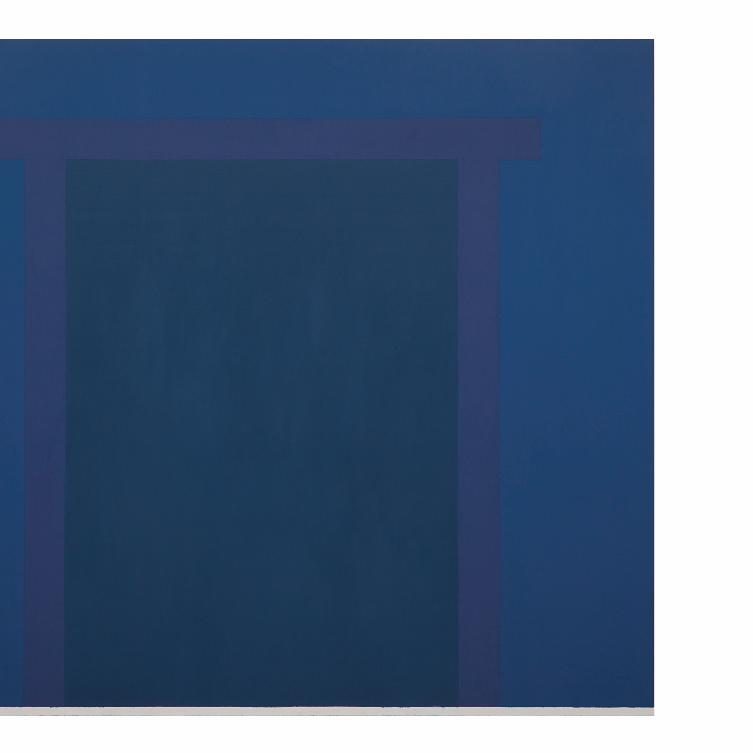
Paulo PastaSem título, 2014Óleo sobre tela180 x 220 cm
Quasefiguraquaseformaok.indd 6 22/07/14 19:15
Quasefiguraquaseformaok.indd 7 22/07/14 19:15

8
se no século XX prevaleceu o conceito de forma, já no último quartel dele e neste início
de século XXI dominam os conceitos de imagem, figura, signo.
A forma vale por si. A imagem, a figura, o signo sempre remetem a algo. Isso não
implica necessariamente uma confiança ingênua num mundo imediatamente repre-
sentável; tampouco a redução do mundo a uma projeção de simulacros sem consistên-
cia, todos indiferentes porque não há nada atrás deles. Se todo signo, na sensibilidade
e na vida contemporânea, remete apenas a outro signo, numa progressão infinita em
que uma realidade virgem, anterior à linguagem, nunca é alcançada, mesmo assim o
próprio signo é uma coisa, possui uma materialidade concreta, é fruto de uma ação real.
A arte brasileira abordou a questão de uma maneira que lhe é peculiar: partindo do
fenômeno mundial da volta à figuração dos anos 80, voltou-se, no final da década, para
uma abstração matérica e gestual, caso raro no panorama internacional. Não se tratou,
porém, de um retorno, e sim de uma depuração: as obras pareceram recuar à fonte
da imagem, colocando-se num limiar onde ela está prestes a aparecer. Já foi dito, por
exemplo, que a pintura de Paulo Pasta é pintura da ausência. Prepara o cenário para que
algo como uma figura emerja, mas não deixa que ela se cristalize, que se torne outra coi-
sa, independente da irradiação das cores e do ato de estendê-las sobre uma superfície.
As formas que ameaçam surgir não são propriamente abstratas, mas tampouco chegam
a se concretizar em algo (uma coluna?; uma viga?; uma porta?). Apenas o vislumbre de
alguma coisa, logo reabsorvido (mas nunca totalmente) pela relação e pela intensidade
das cores.
As ripas e as caixinhas de Sérgio Sister, por outro lado, não são nem objetos nem
pinturas em sentido estrito, mas alguma coisa entre ambos. São frutos de uma nego-
ciação: a pintura renuncia a algo de sua universalidade, o objeto perde parte de sua
contingência. As caixinhas se mimetizam de pinturas, de imagens planas, como certos
Quasefiguraquaseformaok.indd 8 22/07/14 19:15

9
Sergio SisterRipa rude, 1996Óleo sobre madeira170 x 21 cm
Quasefiguraquaseformaok.indd 9 22/07/14 19:15

10
répteis ou insetos são capazes de se parecer com casca de árvore. E as faixas de cor,
por sua vez, adquirem uma realidade tridimensional, um valor de manuseio, um aqui
e agora que sua derivação distante de procedimentos minimalistas (Marden ou Kelly)
não lhe garantiria.
A partir da década de 1990, as esculturas de Paulo Monteiro, ao transferir o corte
neoconcreto (Lygia Clark, mas sobretudo Amilcar de Castro) para uma matéria mole,
que desaba, lhe retirou toda assertividade, o tornou processo orgânico que nunca chega
a uma forma definitiva. As esculturas lineares, grudadas na parede ou precariamente
apoiadas num canto do chão, têm características semelhantes: não se desenham, coam.
Essa poética teve, em tempo recente, um desdobramento imprevisto em pinturas de
cores vivas e contornos quase amorfos, em que as rebarbas, as saliências entre áreas de
tinta, a maneira como esta se acomoda nas laterais da tela – todos os acidentes, enfim,
consequentes à realização do quadro – são planejadas com tanta precisão (ou mais) do
que os planos de cor e as figuras. A imagem, então, se torna uma espécie de película
com vida e estrutura própria.
Entre os artistas dessa linhagem e dessa geração presentes na exposição, Fábio Mi-
guez é certamente o mais imagético: fragmentos de figura e esquemas de composição
derivados da história da pintura (de Piero della Francesca a Matisse e Diebenkorn),
mas também oriundos dos códigos de sinalização, da poesia, da diagramação gráfica,
são dispostos sobre um fundo plano, de cores frias, como sobre uma mesa de trabalho
(o flatbed de Leo Steinberg). Há um constante rearranjo, mas nunca a fixação de um
sentido pleno. Ao contrário, para o bom êxito da obra, é importante que este permane-
ça em grande parte, simbólica e formalmente, submerso. As telas pequenas fornecem
uma espécie de dicionário de formas sempre incompletas, como tantos inícios de nar-
rativa possível.
Quasefiguraquaseformaok.indd 10 22/07/14 19:15

Paulo MonteiroSem título, 2014Óleo sobre tela25 x 19 cm
Quasefiguraquaseformaok.indd 11 22/07/14 19:15

Fabio MiguezTijolo laranja da série Shortcuts, 2013Óleo e cera sobre linho35 x 44 cm
Quasefiguraquaseformaok.indd 12 22/07/14 19:15

O que a geração mais recente herdou desses artistas, e de alguns outros, é a descon-
fiança de soluções gerais, formas muito assertivas – certo cultivo da “forma difícil”, para
retomar a expressão cunhada por Rodrigo Naves. Por outro lado, acentua ainda mais
o caráter episódico, anedótico até, do trabalho artístico, como se colhesse, num fluxo
desordenado de sensações e memórias, fragmentos esparsos, signos de significado vago.
Consciente de que a experiência artística já não é questão de princípios, mas de ocasiões.
Nas telas de Marina Rheingantz, manchas redondas podem virar revoada de in-
setos; um retículo, pescoço de girafa; losangos espalhados no branco do linho, uma
sugestão de paisagem. As camadas de tinta colocadas na tela fazem surgir, por sua pró-
pria superposição ou distanciamento, seres e lugares de existência precária. Cada traço
remete a alguma coisa, embora nunca de maneira unívoca. Não há um sentido preciso
nessas evocações, mas tampouco se trata de uma gestualidade livre, que deixe emergir
um subconsciente. Como em anotações de viagem, coisas acontecem e são registradas.
Os últimos trabalhos de Ana Prata acentuam ainda mais a sensação de fragmenta-
ção e contingência. Suportes de vários formatos e às vezes inesperados – um toco de
madeira, uma tábua enrolada em barbante etc. – encontram-se com figuras traçadas
sumariamente, ou esquemas geométricos elementares. A relação entre imagem e coi-
sa permanece esdrúxula, instável. O sentido da obra está constantemente em aberto:
depende da posição do objeto/imagem no espaço, da relação com outros objetos, das
associações e das memórias que ocasionalmente possa despertar na mente de cada
observador. Toda intuição, toda sensação só parece ter valor se puder se apresentar
como descartável, irrelevante, enfim: marginal em relação àquilo a que costumamos
atribuir valor.
As telas de Tatiana Blass são mais construídas, encenadas. Em geral, dizem respeito
a relações codificadas entre pessoas (Teatro, Entrevista, Voltando para Casa) ou remetem
13
Quasefiguraquaseformaok.indd 13 22/07/14 19:15

14
Marina RheingantzLadrilho, 2014Óleo sobre tela30 x 25 cm
Quasefiguraquaseformaok.indd 14 22/07/14 19:16

15
Ana PrataFormulário, 2014Óleo sobre barbante39 x 26 cm
Quasefiguraquaseformaok.indd 15 22/07/14 19:16

16
Tatiana BlassNavio na praia, 2012Óleo sobre tela110 x 140 cm
Quasefiguraquaseformaok.indd 16 22/07/14 19:16
17
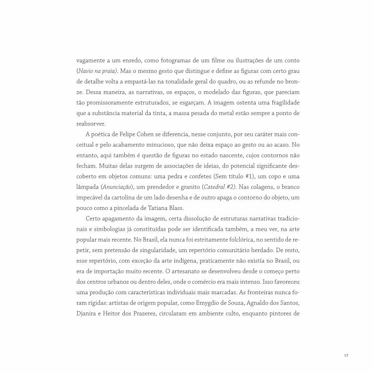
vagamente a um enredo, como fotogramas de um filme ou ilustrações de um conto
(Navio na praia). Mas o mesmo gesto que distingue e define as figuras com certo grau
de detalhe volta a empastá-las na tonalidade geral do quadro, ou as refunde no bron-
ze. Dessa maneira, as narrativas, os espaços, o modelado das figuras, que pareciam
tão promissoramente estruturados, se esgarçam. A imagem ostenta uma fragilidade
que a substância material da tinta, a massa pesada do metal estão sempre a ponto de
reabsorver.
A poética de Felipe Cohen se diferencia, nesse conjunto, por seu caráter mais con-
ceitual e pelo acabamento minucioso, que não deixa espaço ao gesto ou ao acaso. No
entanto, aqui também é questão de figuras no estado nascente, cujos contornos não
fecham. Muitas delas surgem de associações de ideias, do potencial significante des-
coberto em objetos comuns: uma pedra e confetes (Sem título #1), um copo e uma
lâmpada (Anunciação), um prendedor e granito (Catedral #2). Nas colagens, o branco
impecável da cartolina de um lado desenha e de outro apaga o contorno do objeto, um
pouco como a pincelada de Tatiana Blass.
Certo apagamento da imagem, certa dissolução de estruturas narrativas tradicio-
nais e simbologias já constituídas pode ser identificada também, a meu ver, na arte
popular mais recente. No Brasil, ela nunca foi estritamente folclórica, no sentido de re-
petir, sem pretensão de singularidade, um repertório comunitário herdado. De resto,
esse repertório, com exceção da arte indígena, praticamente não existia no Brasil, ou
era de importação muito recente. O artesanato se desenvolveu desde o começo perto
dos centros urbanos ou dentro deles, onde o comércio era mais intenso. Isso favoreceu
uma produção com características individuais mais marcadas. As fronteiras nunca fo-
ram rígidas: artistas de origem popular, como Emygdio de Souza, Agnaldo dos Santos,
Djanira e Heitor dos Prazeres, circularam em ambiente culto, enquanto pintores de
Quasefiguraquaseformaok.indd 17 22/07/14 19:16

18
Felipe CohenSem título # 1, 2014Paralelepípido de granito e confeteEdição única14 x 26 x 15,5 cm
Quasefiguraquaseformaok.indd 18 22/07/14 19:17

19
formação erudita (Guignard, Volpi, Pancetti) se aproximaram da linguagem popular.
Não resta dúvida, no entanto, de que a vocação autoral da arte popular brasileira se
acentuou nos últimos tempos. Provavelmente isso se deve, em parte, às transforma-
ções de um ambiente social que fornecia aos artistas, se não um repertório fixo, pelo
menos certas orientações iconográficas gerais (bichos, profissões, imagens religiosas);
por outro lado, ao refinamento crescente do mercado, que valoriza os artistas excep-
cionais, não redutíveis a um gênero.
O desligamento progressivo de uma “língua geral” é compensado, em muitos ar-
tistas populares mais recentes, por uma relação mais intensa com seus materiais. O
suporte nunca foi neutro, na arte popular. Mesmo que seja um toco retilíneo de ma-
deira, ou o quadrado de uma tela, ele já é uma forma, uma sugestão de imagem. As
figuras devem ser negociadas com essa forma dada, que o artista respeita, seguindo
as ondulações e as divergências da madeira, ou dividindo o plano do quadro em áreas
menores, como um campo a ser cultivado. Isso sempre existiu: é só observar, para fi-
carmos entre os artistas presentes nesta exposição, com quanta delicadeza um artista
ainda ligado ao imaginário tradicional, como João Francisco da Silva, se deixa conduzir
pela madeira. Mas a negociação passa a ser explícita, ao ponto de se tornar o próprio
centro do trabalho, em artistas como Véio ou José Bezerra.
Quando Véio diz que seu trabalho é devolver vida à madeira morta, ou quando
Bezerra afirma que é preciso “abrir” a madeira para encontrar dentro dela a escultura já
pronta (olha onde foi parar Michelangelo...), eles atribuem ao material uma autoridade
que antigamente era da tradição. Nesse sentido, estão se tornando artistas modernos.
Mas, como ainda fincam raízes num mundo rural, para eles toda forma é bicho, ser
vivo. Nem precisa mais que sejam bichos reconhecíveis: são bichos-troncos, bichos-ra-
ízes, suspensos entre o vegetal e o animal. Véio esculpe com a cor, de maneira sempre
Quasefiguraquaseformaok.indd 19 22/07/14 19:17

João Francisco da SilvaSem título, 2008Escultura em madeira158 x 42 x 47 cm
Quasefiguraquaseformaok.indd 20 22/07/14 19:17

Cícero Alves dos Santos [Véio]Sem título, 2011Escultura em madeira, tinta acrílica55 x 40 x 124 cm
João Francisco da SilvaSem título, 2008Escultura em madeira158 x 42 x 47 cm
Quasefiguraquaseformaok.indd 21 22/07/14 19:17

José BezerraSem título, 2011Escultura em madeira28 x 20 x 82 cm
João Cosmo Felix [Nino]Sem título, 2008Escultura em madeira158 x 42 x 47 cm
22
Quasefiguraquaseformaok.indd 22 22/07/14 19:17

23
Quasefiguraquaseformaok.indd 23 22/07/14 19:17

24
mais econômica e depurada. O controle que exibe, ao reanimar a madeira com poucos
toques, o domínio de seus meios, apazigua a estranheza das figuras, torna-as quase
clássicas. Bezerra, ao contrário, é dramático, se não trágico: volta a esboçar, por fora, o
que a natureza já esboçou por dentro; o choque, na superfície da madeira, desses dois
esforços de formalização é sofrido, intenso.
Nino é mais leve. Tudo nele é gentil. De resto, pertence a uma geração anterior. Mas
nas estelas em baixo-relevo, que são sua marca registrada, o conto popular já se mis-
tura com a história em quadrinhos e as cores delicadas remetem tanto ao reboco das
casas do interior quanto à impressão barata dos gibis em quatro cores. É como se Nino
recapitulasse, em suas narrativas elípticas, toda uma cultura, e se colocasse assim, com
elegância inefável, no limiar entre duas épocas.
Quanto aos pintores, a questão é ainda diferente. Por sua natureza, a pintura po-
pular é mais urbana, mais próxima ao circuito convencional da arte. Requer espaços
menores do que a escultura para ser produzida e se acomoda melhor aos apartamentos
de um colecionismo médio ou pequeno. Os escultores residem, em sua maioria, em
pequenos centros ou em zonas rurais, onde são figuras de destaque. Os pintores vivem
amiúde em áreas pobres das grandes cidades e estão em condição mais próxima da
daqueles que, em outros países, são classificados como “artistas outsiders”. Mas é jus-
tamente essa visão periférica que confere pregnância a suas obras. O impacto, muitas
vezes dolorido, com o mundo contemporâneo é enfrentado bravamente por um ima-
ginário que tem raízes arcaicas, mas que as condições atuais obrigam a uma constante
renovação.
Nesse cenário, Neves Torres talvez seja uma exceção parcial. Embora resida em
Vitória, passou grande parte de sua vida no interior de Minas Gerais, em Mutum. Co-
Quasefiguraquaseformaok.indd 24 22/07/14 19:17

25
Neves TorreSem título, 2013Óleo sobre tela50 x 70 cm
Quasefiguraquaseformaok.indd 25 22/07/14 19:17

26
meçou a pintar depois de aposentado, e a sua arte fala de um mundo prestes a desa-
parecer, ou já desaparecido. Recapitulação, um pouco como em Nino, mas com maior
distanciamento e nostalgia. Com o escultor, aliás, entretém semelhanças inclusive
pelo gosto das cores delicadas. Neves Torres gosta de graduá-las: do azul-cinza ao
lilás, do amarelo ao verde-limão ao verde-escuro. É um mundo ordenado, nomeado
item por item: não apenas cada figura tem sua cor, como a cada figura corresponde
um fundo de uma cor específica, que é também o tom exato de sua intensidade afe-
tiva. Tudo, na memória, tem a mesma importância: uma casa, um rosto, um galho,
um tufo de grama.
As mudanças foram mais violentas para Alcides: da Bahia a Mato Grosso, de Mato
Grosso, já sessentão, para a periferia de São Paulo. Todas as telas incluídas nesta ex-
posição foram realizadas após essa última mudança. Numa delas, Alcides funde uma
paisagem rural com uma parede de tijolos. Em outras, as máquinas que dominam o
ambiente em que Alcides é chamado a viver (aviões, caminhões, navios, canhões) são
esquematizadas de maneira a lembrar brinquedos de lata, daqueles que se vendem
à beira da estrada. Mas a potência ameaçadora que a redução a brinquedo retira das
máquinas lhes é parcialmente devolvida pela escala (os quadros de Alcides precisam ser
grandes) e pelo fato de elas ocuparem quase inteiramente a superfície do quadro, ao
ponto de se identificar com ele. A máquina é o quadro, e vice-versa.
Aurelino é certamente o mais conflituoso dos pintores que mostramos aqui. Ele
não tem uma memória rural para contrapor a uma cidade que, com o passar dos anos,
lhe parece sempre mais densa e barulhenta. Nasceu na cidade, é fruto da cidade. Para
estancar o movimento que o cerca, e que deve lhe parecer frenético, recorre ao plano da
tela e a gabaritos que encontra na rua (tampas circulares, varetas). Suas telas fervilham
de uma vida inquieta que apenas as divisões geométricas mantêm no lugar. As cores,
Quasefiguraquaseformaok.indd 26 22/07/14 19:17

27
Alcides Prereira dos SantosA vida no campo, 2008Acrílico sobre tela86 x 150 cm
Quasefiguraquaseformaok.indd 27 22/07/14 19:17

28
todas levadas ao máximo de intensidade, não dialogam, ombreiam-se, cada um que-
rendo invadir a outra. O plano da tela é o lugar da luta cotidiana entre a ordem e o caos.
Ranchinho é um mistério. Sofria de transtornos mentais especialmente graves, mal
conseguia se expressar pela fala. Certamente, parte do fascínio de seus quadros deriva
da sensação de imediatidade e liberdade que compartilham com os desenhos das crian-
ças. Mas a partir daí Ranchinho desenvolveu composições complexas, equilibradas,
com um raro senso do espaço e da profundidade. É um mundo visto de relance mas já
completo e rico nesse instante. Sua pintura sugere como poderia ser a inteligência do
mundo, se pudesse chegar a um desenvolvimento pleno sem a mediação da linguagem.
Lorenzato está no polo contrário. Embora de origem popular e formação modesta,
era um homem viajado, viu museus, frequentou a academia, trabalhou como restaura-
dor nos afrescos de Rafael na Vila Farnesina, de Roma. Em Florença, onde residiu na
década de 1920, deve ter tomado conhecimento do movimento “Strapaese”, dissidên-
cia de “Novecento”, que defendia uma pintura artesanal e programaticamente “provin-
ciana”. Em todo caso, para ele a arte popular foi uma escolha, mais do que uma neces-
sidade biográfica. Sua pintura penteada (literalmente, passando o pente na matéria
densa) mas não lambida (“gosto mais de Masaccio do que de Rafael”, costumava dizer,
“porque Rafael é muito lambido”) não se recusa a referências cultas, principalmente
da pintura italiana, mas as rebaixa para um tom artesanal, coloquial. As duas telas
que mostramos, do final da vida, poderiam ser classificadas como abstratas. Mas uma
sugere a sobra de galhos estampados na relva, a outra parece ampliação de fragmentos
de alguma coisa. Como a pintura “erudita” mais recente, não remetem a princípios for-
mais gerais: são configurações ocasionais, esboços de sensações, encontros.
Quasefiguraquaseformaok.indd 28 22/07/14 19:17

29
Aurelino dos SantosSem título, 2003Acrílica sobre eucatex73,5 x 82,5 cm
Quasefiguraquaseformaok.indd 29 22/07/14 19:17
30
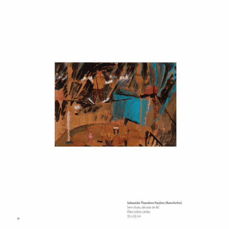
Sebastião Theodoro Paulino [Ranchinho]Sem título, década de 80Óleo sobre cartão35 x 50 cm
Quasefiguraquaseformaok.indd 30 22/07/14 19:17

31
Amadeo LorenzatoSem título, 1991Óleo sobre tela60 x 40 cm
Quasefiguraquaseformaok.indd 31 22/07/14 19:17

Um: pod de canhão 1997Acrílica sobre tela90 x 148 cm
32
Quasefiguraquaseformaok.indd 32 22/07/14 19:17

33
Os Abaltros, 1996Acrílica sobre tela90 x 150 cm
Alcides Pereira dos Santos
Quasefiguraquaseformaok.indd 33 22/07/14 19:17

34
Sem título, 1989Óleo sobre tela sobre eucatex100 x 80 cm
Quasefiguraquaseformaok.indd 34 22/07/14 19:17

35
Amadeo Lorenzato
Sem título, 1989Óleo sobre tela 46 x 42 cm
Quasefiguraquaseformaok.indd 35 22/07/14 19:17
36
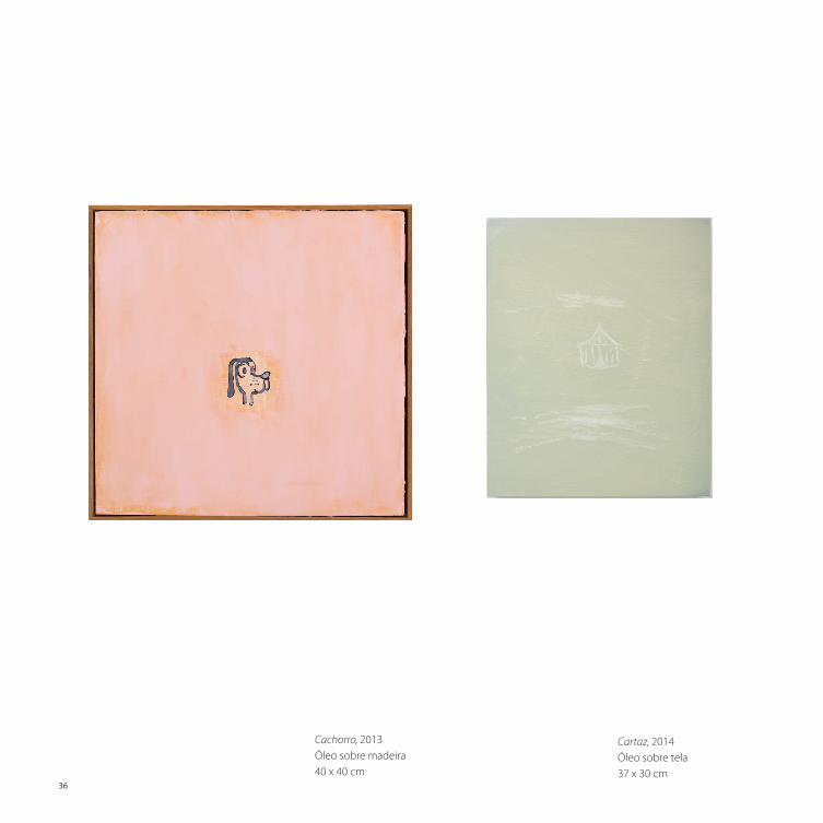
Cachorro, 2013Óleo sobre madeira40 x 40 cm
Cartaz, 2014Óleo sobre tela37 x 30 cm
Quasefiguraquaseformaok.indd 36 22/07/14 19:17

37
Cartaz, 2014Óleo sobre tela37 x 30 cm
Paisagem com montanha, 2014Óleo sobre tela, pedra35 x 24 cm
Menina, 2013Óleo sobre madeira52 x 38 cm
Quasefiguraquaseformaok.indd 37 22/07/14 19:18
Ana Prata
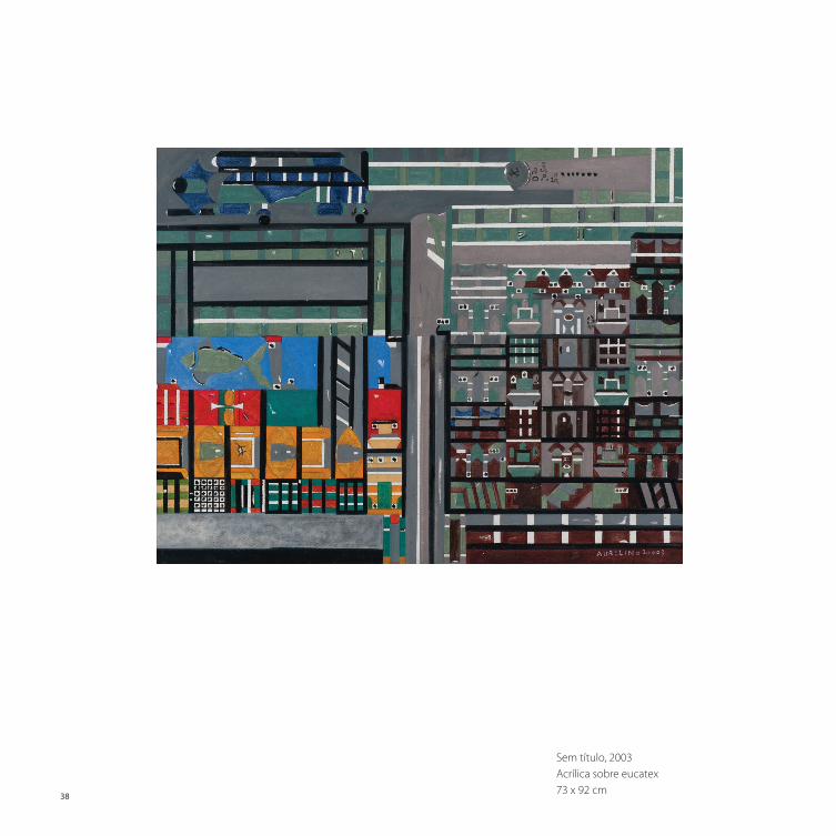
Sem título, 2003Acrílica sobre eucatex73 x 92 cm
38
Quasefiguraquaseformaok.indd 38 22/07/14 19:18

39
Sem título, 1997Acrílica sobre tela40 x 50 cm
Aurelino dos Santos
Quasefiguraquaseformaok.indd 39 22/07/14 19:18

40
Sem título, 2013Escultura em madeira e tinta acrílica117 x 45 x 61 cm
Quasefiguraquaseformaok.indd 40 22/07/14 19:18

41
Sem título, 2013Escultura em madeira e tinta acrílica86 x 98 x 47 cm
Cícero Alves dos Santos [Véio]
Quasefiguraquaseformaok.indd 41 22/07/14 19:18

42
Fonte, da série Shortcuts, 2013Óleo e cera sobre linho33 x 40 cm
Praça, da série Shortcuts, 2013Óleo e cera sobre linho33 x 40 cm
Quasefiguraquaseformaok.indd 42 22/07/14 19:18

43
Fabio Miguez
Janela 2, da série Shortcuts, 2012Óleo e cera sobre linho40 x 33 cm
Quasefiguraquaseformaok.indd 43 22/07/14 19:18

44
Sem título, 2014Colagem com papel crescent83,5 x 103,5 cm cada parte (díptico)
Quasefiguraquaseformaok.indd 44 22/07/14 19:18

45
Catedral #2, 2010Pregador de madeira e travertino romano16,5 x 9,5 x 2 cm
Felipe Cohen
Quasefiguraquaseformaok.indd 45 22/07/14 19:18

46
Sem título, sem dataEscultura em madeira109 x 24 x 22 cm
Quasefiguraquaseformaok.indd 46 22/07/14 19:18

47
Sem título, sem dataEscultura em madeira109 x 24 x 22 cm
João Cosmo Felix [Nino]
Sem título, sem dataEscultura em madeira110 x 40 x 30 cm
Quasefiguraquaseformaok.indd 47 22/07/14 19:18

48
Sem título, 2008Escultura em madeira54 x 10 x 56 cm
Quasefiguraquaseformaok.indd 48 22/07/14 19:19

49
João Francisco da Silva
Sem título, 2008Escultura em madeira5,5 x 3 x 44 cm
Quasefiguraquaseformaok.indd 49 22/07/14 19:19

50
Sem título, 2011Escultura em madeira75 x 43 x 47 cm
Quasefiguraquaseformaok.indd 50 22/07/14 19:19

51
Sem título, 2011Escultura em madeira75 x 43 x 47 cm
José Bezerra
Sem título, sem dataEscultura em madeira107 x 90 x 23 cm
Quasefiguraquaseformaok.indd 51 22/07/14 19:19

52
Miniatura, 2014Óleo sobre tela60 x 80 cm
Quasefiguraquaseformaok.indd 52 22/07/14 19:19

53
Sigmar, 2014Óleo sobre tela24 x 30 cm
Marina Rheingantz
Quasefiguraquaseformaok.indd 53 22/07/14 19:19

54
Casas e árvores, 1971Óleo sobre eucatex50 x 70 cm
Quasefiguraquaseformaok.indd 54 22/07/14 19:19

55
Sem título, 1971Óleo sobre tela50 x 70 cm
Neves Torres
Quasefiguraquaseformaok.indd 55 22/07/14 19:19
56
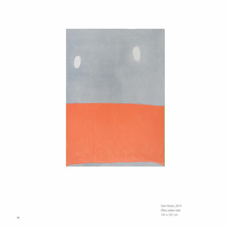
Sem título, 2014Óleo sobre tela141 x 101 cm
Quasefiguraquaseformaok.indd 56 22/07/14 19:19

Sem título, 1994Chumbo32 x 36 x 40 cm
Paulo Monteiro
Quasefiguraquaseformaok.indd 57 22/07/14 19:19

58
Sem título, 1999Óleo sobre tela25 x 35 cm
Sem título, 1997/98Óleo sobre tela20 x 26 cm
Quasefiguraquaseformaok.indd 58 22/07/14 19:19

59
Sem título, 1999 Óleo sobre tela22 x 26 cm
Paulo Pasta
Sem título, 1994Óleo sobre tela22 x 26 cm
Quasefiguraquaseformaok.indd 59 22/07/14 19:19

60
Sem título, 1988Óleo sobre tela sobre cartão33 x 40 cm
Quasefiguraquaseformaok.indd 60 22/07/14 19:20

61
Sem título, 1985Óleo sobre eucatex29 x 39 cm
Sebastião Theodoro Paulino [Ranchinho]
Quasefiguraquaseformaok.indd 61 22/07/14 19:20

62
Sem título, 1980Afresco39 x 48 cm
Caixa, 2014Óleo sobre madeira38 x 23 x 7 cm
Caixa, 2014Óleo sobre madeira38 x 23 x 7 cm
Quasefiguraquaseformaok.indd 62 22/07/14 19:21

63
Caixa, 2014Óleo sobre madeira38 x 23 x 7 cm
Terceiro fundo, 2014Óleo sobre madeira53 x 30 x 15 cm
Terceiro fundo, 2014Óleo sobre madeira53 x 30 x 15 cm
Sergio Sister
Quasefiguraquaseformaok.indd 63 22/07/14 19:21

64
Teatro #3, 2013Óleo sobre tela80 x 100 cm
Quasefiguraquaseformaok.indd 64 22/07/14 19:21

65
Entrevista #1.1 , 2013Bronze fundidoEdição: 2/3 + 1 P.A.70 x 30 x 25 cm
Tatiana Blass
Quasefiguraquaseformaok.indd 65 22/07/14 19:22

66
The art that we like
A relationship based on seriousness and coherence, arising from personal coexistence that has been getting more fre-quent, culminating with the carrying out of this exhibition.
This is why, talking at the end of last year, Vilma and I had the idea of bringing together two worlds that are so different yet so near for one single reason: art – for all the experience that expands our world and our lives.
On suggesting this meeting, we reaffirm the convic-tion that art is art and that we should, yes indeed, open ourselves to looking, seeing and viewing everything that is good and which is around us. If we do not do this, we shall lose.
We knew that this would be a major challenge, and thus we immediately had the idea of inviting Lorenzo Mammì, a thinker for whom we have great respect and that, without any doubt, would be able to analyse the agreements and disagreements that the “popular” and “erudite” worlds pro-vide for us.
If our idea was to expand and bring new information, we were sure that all the artists and galleries involved would be honoured to participate in this new venture. And so happens Almost figure, almost shape.
Socorro de Andrade LimaVilma Eid
Quasefiguraquaseformaok.indd 66 22/07/14 19:22

67
Almost figure, almost shapeLorenzo Mammì
Placing side by side works that, for lack of a better term, are often considered as “erudite” together with others from the parallel circuit, in Brazil particularly inexperienced, known as popular art is a delicate task. The references of the artists are not the same, even though there could be some punc-tual similarities. The scale of values depends on the con-text. Even so, for me it seems possible to identify, between the “erudite” and the popular production of the last thirty years, a convergence which is worth exploring. It refers not only to changes of poetics but also transformation of the very circulation of art and the awareness that the artists have of their own work.
In relation to the first group: the last three decades have once again put participation on the agenda. Not only pho-tography and video, for which the relation to the reference is a structural characteristic, but also, and maybe more sig-nificantly, painting: all have started to reconsider the issue of the image as from the 1970s. The two first, indeed, re-newed their repertoire by considering the procedures and the different forms of presentation of painting. Maybe it could even be said that, if the 20th Century was a century of abstraction, then the 21st Century starts as a figurative entity. Stated in another way, this means that if the concept of shape prevailed in the 20th Century, in the last quarter of
the century and also in this dawn of the 21st Century the elements of image, figure and sign dominate the scene.
The shape has value on its own, while the image, the figure or the sign always link up to something. This does not necessarily mean a naïve confidence in a world that can be represented immediately, or even that the world may be reduced to a projection of an effigy or imitation, without any consistency, all indifferent as there is nothing behind it. If every sign, in sensitivity and contemporary living, links up only to another sign, in an infinite sequence in which the bare reality, prior to language, is never reached, even so the sign is something in itself and has concrete materiality, and is the result of real action.
Brazilian art has addressed the issue in a way that is very peculiar: starting out from the world phenomenon of a return to the fuguration characteristic of the 1980s, at the end of the decade there was a return to material and gestural abstraction, something very rare on the interna-tional scene. However, this was not a case of a return, but rather of a cleansing operation: the works seem to retreat back to the source of the image, positioning itself at a point where it is about to appear. It has already been mentioned, for example, that the paintings of Paulo Pasta are an ex-ample of paintings of absence. He prepares the scene so that something like a figure may emerge, but does not let this process get finalised, becoming something else, regard-less of the irradiation of colour and the act of spreading the colour out on a surface. The shapes that now threaten to come through are not exactly abstract, but at the same time do not take on a concrete form (a column? a beam? a door?), but only something which is soon reabsorbed (but not entirely) by the relations between the colours and the intensity thereof. The strips of wood and boxes in the work of Sergio Sister, on the other hand, are not objects, or even
Quasefiguraquaseformaok.indd 67 22/07/14 19:22

68
paintings, in the strict sense, but rather something between the two. They are the results of a process of negotiation: the painting renounces part of its universality, and the object loses part of its contingency. The boxes mimic as paintings, of flat images, as certain reptiles or insects are able to look like the bark of a tree. The strips of colour, in turn, acquire a three-dimensional reality, a handling value, one here and now that its distant derivation from minimalist procedures (Marden or Kelly) would not assure.
As from the 1990s, the sculptures of Paulo Monteiro, on transferring the neoconcrete cutting (seen in Lygia Clark, but above all in Amilcar de Castro) into a soft mate-rial which collapses, removed all assertiveness, and made it an organic process which never reaches its definite form. The linear sculptures, stuck to the walls or precariously sup-ported in one corner of the floor, have similar characteris-tics: they do not draw, but rather sift. These poetics have, in recent time, shown an unpredictable consequence in paint-ings with live colours and almost amorphous contours, in which the rough edges, and protuberances between painted areas, the way this fits into the sides of the picture – all fea-tures, after all, that result from the execution of the picture – are planned with so much accuracy (or even more) as the plans for colours and figures. The image therefore becomes a kind of film with its own life and structure.
Among the artists of this lineage and this generation who are present at the exhibition, Fabio Miguez is certainly the most imaginative: fragments of figures and composi-tion schemes derived from the history of painting (from Piero della Francesca to Matisse and Diebenkorn), but also arising from the signalling codes, poetry, graphic design, are laid out on a flat background in cold colours, as if on a work table (the flatbed of Leo Steiberg). There is a constant process of rearrangement, but never the fixation of a full
meaning. Much to the contrary, for the success of the work, it is very important that this remains largely symbolic and formally submerged. The small pictures provide a kind of dictionary of shapes, always incomplete, such as so many starts of possible narrative.
What the most recent generation has inherited from these artists and also from some others is the suspicion regarding general solutions, highly assertive shapes – a certain cultivation of the “difficult shape”, to readdress the expression coined by Rodrigo Naves. On the other hand, it further accentuates the episodic and even anecdotal char-acter of artistic work, as if collecting, within a disorganised flow of feelings and memories, sparse fragments, signs with a vague meaning. All this, aware that the artistic experience is no longer a matter of principles, but rather of occasions.
In the pictures by Marina Rheingantz, round stains could be turned into a flight of insects; a netting, into the neck of a giraffe; lozenges spread onto the white of linen, a suggestion of a landscape. The coats of paint placed on the screen make beings and places of precarious existence appear, through the superimposition or distancing thereof. Each stroke is associated with something, although never in a single way. There is no precise meaning in these invo-cations, and this is similarly not a case of free gestuality, which would make a subconscious emerge. Like in travel notes, things happen and are noted down.
The last works of Ana Prata further enhance the overall feeling of fragmentation and contingency. Supports of sev-eral different formats and sometimes unexpected – a stub of wood; a board enwrapped in barbed wire etc. – meet up with figures that have been summarily penned, or elemen-tary geometrical schemes. The relation between the image and the physical object is still unstable and unusual. The meaning of the work is always open: it depends on the posi-
Quasefiguraquaseformaok.indd 68 22/07/14 19:22

69
tion of the object or image in space, the relationship with other objects, associations and also memories that this could occasionally stir up in the mind of each observer. All this intuition, all the feelings, only seem to have value if it can be presented as something disposable or irrelevant, after all: marginal in relation to what we normally ascribe a value to.
The paintings by Tatiana Bliss are more constructed and enacted. In general, these refer to encoded relationships be-tween people (Theatre, Interview, Going back home) or refer vaguely to a plot, such as photograms of a film or illustra-tions of a tale (Ship on the beach). However, the same gesture that distinguishes and defines the figures with a certain de-gree of detail once again pastes them in the general hue of the picture, or recasts them in bronze. Thus, the narratives, spaces, the model of the figures, which seem to have been so promisingly structured, now get worn out. The image shows a fragility that the material of the paint, the heavy mass of the metal, is always able to reabsorb.
The poetics of Felipe Cohen stands out, in this universe, because of its more conceptual characteristics and also its carefully crafted finish that does not leave any room for ges-tures or randomness. However, here there is also an issue of figures in the nascent state, whose contours do not close. Many of these arise from association of ideas, the signifi-cant potential discovered and present in common objects: a stone and confetti (No title #1), a glass and a lamp (An-nunciation), a clasp and granite (Cathedral). In the collages, the impeccable white cardboard on the one side draws and on the other side wipes out the contours of the object, a bit like the strokes of Tatiana Bliss.
A certain erasure of the image, a certain dissolution of traditional narrative structures and symbologies that have already been established may also be identified, as I see
it, in more recent popular art. In Brazil, it has never been strictly folklore, in the sense that it repeats, without any in-tention of singularity, an inherited community repertoire. Apart from this, the fact is that this repertoire, with the exception of Native Brazilian art, practically did not exist in Brazil, or was a very recent import. Handicrafts developed from the very beginning close to urban centres or even within them, where commercial activity was more intense. This favoured a production with more noticeable individual characteristics. The borders between these have never been strictly defined: artists with a popular origin, such as Emyg-dio de Souza, Agnaldo dos Santos, Djanira and Heitor dos Prazeres, circulated in a cultured environment, while paint-ers of an erudite background (Guignard, Volpi, Pancetti) became closer to popular language. There is no doubt that the authorial vocation of Brazilian popular art got stronger in recent times. This was probably partly due to the trans-formation of a social environment which supplied the art-ists, if not with a fixed repertoire, at least certain general iconographic guidance (animals, professions, and religious images); on the other hand, the growing refinement of the market, which gives value to exceptional artists, not limit-able to any particular genre.
The gradual switching off of a “general language” is compensated, in many more recent popular artists, by a more intense relationship with their materials. The support has never been neutral, in the realm of popular art. Even though this may be a straight stub of word, or the square of a canvas screen, this is already a shape, the suggestion of an image. The figures need to be traded with this given shape, which the artist respects, according to the undula-tions and the deviations of wood, or dividing the plane of the picture into smaller areas, like a field to be cultivated. This has always been the case: we just need to look, to be
Quasefiguraquaseformaok.indd 69 22/07/14 19:22

70
in this manner, with ineffable elegance, on the border be-tween two eras.
Regarding the painters, the issue is different yet again. By its nature, popular painting is more urban, closer to the conventional circles of art. It also requires less space than sculpture, in order to be produced, and fits in better with the apartment of a medium or small collectionism. Sculp-tors live mainly in small urban centres or in rural areas, where they are prominent figures. Painters tend to live in poor districts of large cities, being in conditions closer to those who, in other countries, are considered “outsider art-ists”. However, it is this peripheral vision that grants preg-nancy to his works. The impact, often painful, with the con-temporary world is bravely tackled by an imagination with archaic roots, but the current conditions demand constant renewal.
In this scenario, Neves Torres could be a partial excep-tion. Even though he has a place of abode in Vitória, he spent much of his life in the countryside of the state of Mi-nas Gerais, in the city of Mutum. He started to paint after he retired, and his art talks about a world that is about to disappear, or which has already disappeared. This is also a recapitulation, a bit like it is in Nino, but with greater dis-tance and nostalgia. With this sculptor, however, he has similarities, including the like for delicate colours. Neves Torres likes to graduate them: from greyish blue to lilac, from yellow through lemon green to dark green. This is an organised world, organised on an item by item basis: not only each figure has its colour, as also each figure corre-sponds to a background of a specific colour, which is also the exact tone of his affective intensity. Everything in memory has the same importance: a house, a face, a tree branch, a tuft of grass.
among the artists present at this exhibition, and see with what delicateness an artist still strongly linked to tradition-al imagery, such as João Francisco da Silva, lets himself be carried away by wood. However, the negotiation becomes explicit, to the extent that this becomes the main work cen-tre, in artists such as Véio or José Bezerra.
When Véio says that his work is to bring life back to dead wood, or when Bezerra says that there is a need to “open” the wood to see the sculpture, all ready, inside it (look at where Michelangelo has ended up…), they are be-stowing on the materials an authority that formerly rested with tradition. In this sense, they are becoming modern artists. However, as they still establish their roots in the rural environment, they see each shape as an animal, as a living being. There is no longer a need for these to be rec-ognisable animals: these are trunk-animals, root-animals, hovering between plant and animal. Véio sculpts with col-our, in a way that is always more economical and cleaner.The control that he shows, on reanimating wood with only a few strokes, the domain over his means, calms down the strangeness of the figures, making them almost clas-sical. Bezerra, on the contrary, is dramatic if not tragic: on the outside, once again he drafts when nature has already penned on the inside; the shock, on the wooden surface, of these two efforts at formalisation is intense and character-ised by suffering.
Nino is lighter, and everything inside him is polite. Otherwise, he belongs to an older generation. However, in the steles in bas-relief, which are his trademark, the popular tale already gets mixed with the comic strip, and the delicate colours refer both to the plaster of the coun-tryside houses and also the cheap printing of comics in four colours. It is as if Nino recollected, in the elliptical narratives, the whole of a culture, and if this was placed
Quasefiguraquaseformaok.indd 70 22/07/14 19:22

71
pictures comes from the feeling of immediacy and freedom that he shares with the drawings of the children. From then on, Ranchinho developed complex and balanced composi-tions, with a rare sense of space and depth. This is a world seen in a glance but which is already complete and rich at this instant. The painting suggests how the intelligence of the world could be, if it were possible to reach full develop-ment without the mediation of language.
Lorenzato is at the opposite end. Even though he had a poor background and limited education and schooling, he was a well-travelled man and had the opportunity to see museums, be part of academia, and work as a restorer of the al frescos by Raphael at Vila Farnesina, in Rome. In Florence, where he lived in the 1920s, he probably be-came familiar with the “Strapaese” movement, a breakaway group from the “Novecento” that defended an artisanal style of painting, programmatically from the countryside. In any case, for him popular art was a choice, more than a biographical need. His combed painting (literally, passing the comb through the dense materials), not excessively po-lite (“I like Masaccio more than Raphael”, he would say, “as Raphael is too retouched”), does not reject any cultural ref-erences, especially from Italian painting, but brings them down to an artisanal and colloquial tone. The two works that we show, from the end of his life, could be considered abstract. But one suggests an excess of twigs stamped upon the grass, while the other seems to be made of fragments of something. Like the more recent “erudite” paintings, they do not link up to the general formal principles: these are oc-casional configurations, drafts of feelings, meetings.
For Alcides, the changes were rougher: from Bahia to Mato Grosso and then, when Alcides was already in his six-ties, from Mato Grosso to the outskirts of São Paulo. All the works included in this exhibition were made after this last change. In one of them, Alcides blends a rural landscape in with a brick wall. In others, the machines that dominate the environment where Alcides is called to live (aeroplanes, lorries, ships and cannons) are sketched in such a way that one would remember tin toys, those that at one time were sold at the roadside. However, the threatening power that reduction to a toy removes from the machines is, indeed, partly returned by the scale used (Alcides’ paintings need to be large in size) and also due to the fact that they take up almost the whole surface of the picture, to the extent that there is identification with it. The machine is the picture, and the picture is the machine.
Aurelino is surely the most conflicting of the painters that we shall be showcasing here. He does not have any rural memories to contrast with a city that over the ages seems to be denser and noisier. He was born in the city and is a product of the city. To ease the movement sur-rounding him, and which should seem frenetic to him, he resorts to using the plane of the screen and also the refer-ence material found in the street (circular lids, small rods). His pictures bubble, showing a restless life in which only the geometric divisions are kept in their place. The colours, which are all expanded to a maximum intensity, do not es-tablish a dialogue, but rather dislodge each other, shoulder to shoulder, with each colour wishing to invade the other. The plane of the screen is the venue of the daily fight be-tween order and chaos.
Ranchinho is a mystery. He suffered from very seri-ous mental problems, and could hardly express himself by speaking. Surely, part of the fascination present in his
Quasefiguraquaseformaok.indd 71 22/07/14 19:22

Quase figura, quase forma, 2014
Galeria Estação | Diretores
Vilma EidRoberto Eid Philipp
Galeria Millan | Diretores
André Millan Socorro de Andrade Lima
Curadoria
Lorenzo Mammì
Textos
Lorenzo Mammì
Galeria Estação/Galeria Millan
Produção e desenho gráfico
Germana Monte-Mór
Secretaria de produção
Caroline CarrionGiselli Mendonça GumieroRenata Nantes
Fotos
Eduardo Ortega, página 57
Everton Ballardin, páginas 6, 7, 15, 18, 36, 37, 45, 64, 65
Germana Monte-Mór, páginas 4, 20-22, , 29, 38-41, 48, 49
João Liberato, páginas 9, 11, 12, 14, 23, 25, 27, 24 , 27, 30-35, 42-44,
46, 47, 50-56, 58-63
Milene Rinaldi, página 16
Versão de textos para o ingles Paul Willian Dixon
Revisão de texto Otacílio Nunes
Montagem Carlos Eduardo Pimentel
Assessoria de Imprensa Pool de comunicação
Impressão e acabamento Lis Gráfica
Agradecimentos
Galeria Fortes Vilaça, Galeria Nara Roesler, Galeria Mendes Wood DM
rua Ferreira de Araujo 625 Pinheiros SP 05428001fone 11 3813 7253 www.galeriaestacao.com.br
Quasefiguraquaseformaok.indd 72 22/07/14 19:22

ww
Quase figura, Q
uase forma
GA
LERIA ESTA
ÇÃ
O 2014
Quase figura,Quase forma
curadoria Lorenzo Mammì
Alcides Pereira dos Santos
Amadeo Lorenzato
Ana Prata
Aurelino dos Santos
Cícero Alves dos Santos [Véio]
Fabio Miguez
Felipe Cohen
João Cosmo Felix [Nino]
João Francisco da Silva
José Bezerra
Marina Rheingantz
Neves Torres
Paulo Monteiro
Paulo Pasta
Sebastião Theodoro Paulino [Ranchinho]
Sergio Sister
Tatiana Blass
QuaseCapa2014.indd 1 15/07/14 19:36